Blue Zones Packaging
CREATIVE DIRECTION, Packaging, Illustration, Art Direction
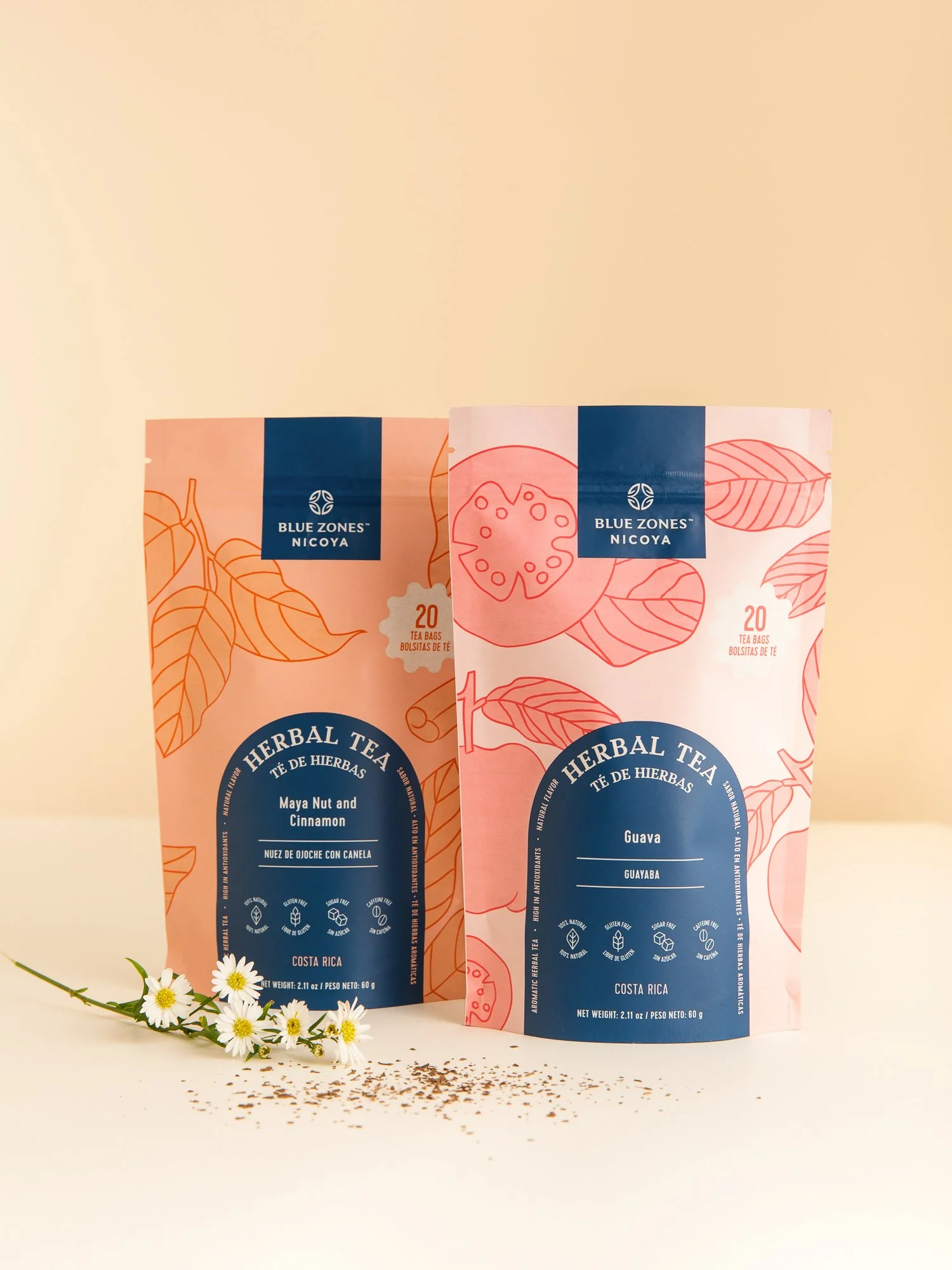
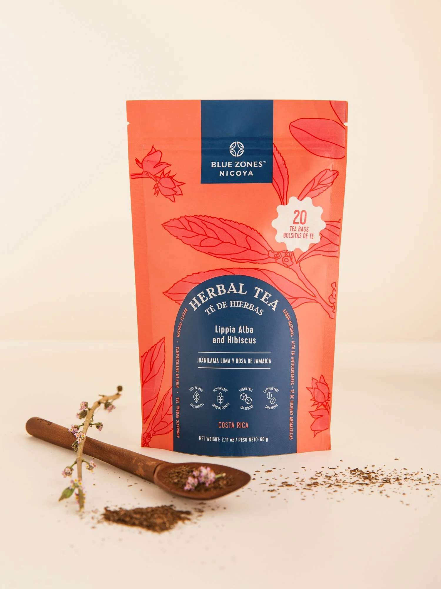
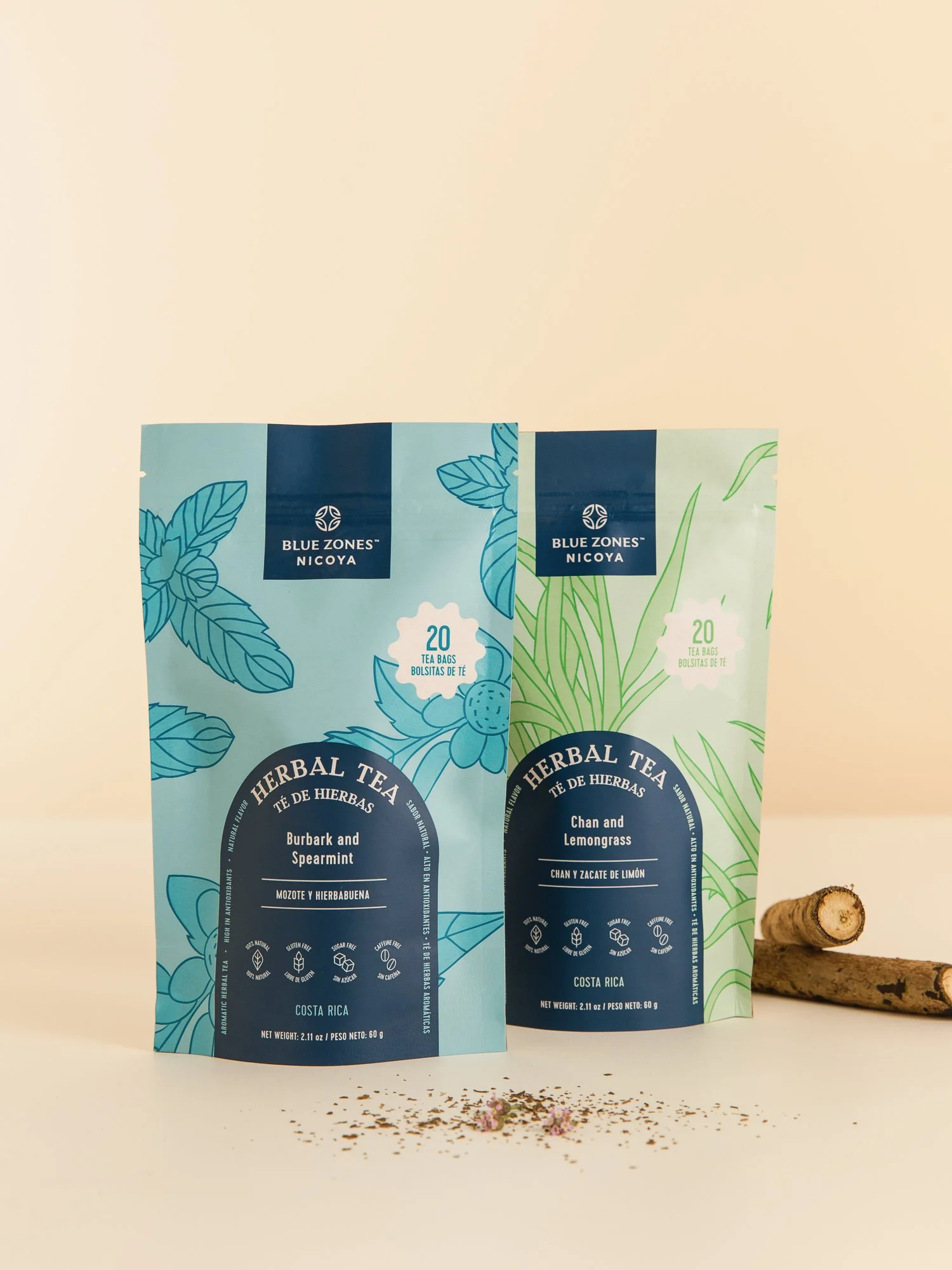
I collaborated with Blue Zones Nicoya on for over two years, reimagining the brand and crafting individual identities and packaging for more than 20 products.Photography by: Leonardo CarvajalHerbal Tea
The design and illustrations draw inspiration from the ingredients themselves, celebrating their natural beauty and connection to the region’s rich heritage.Single Origin Honey
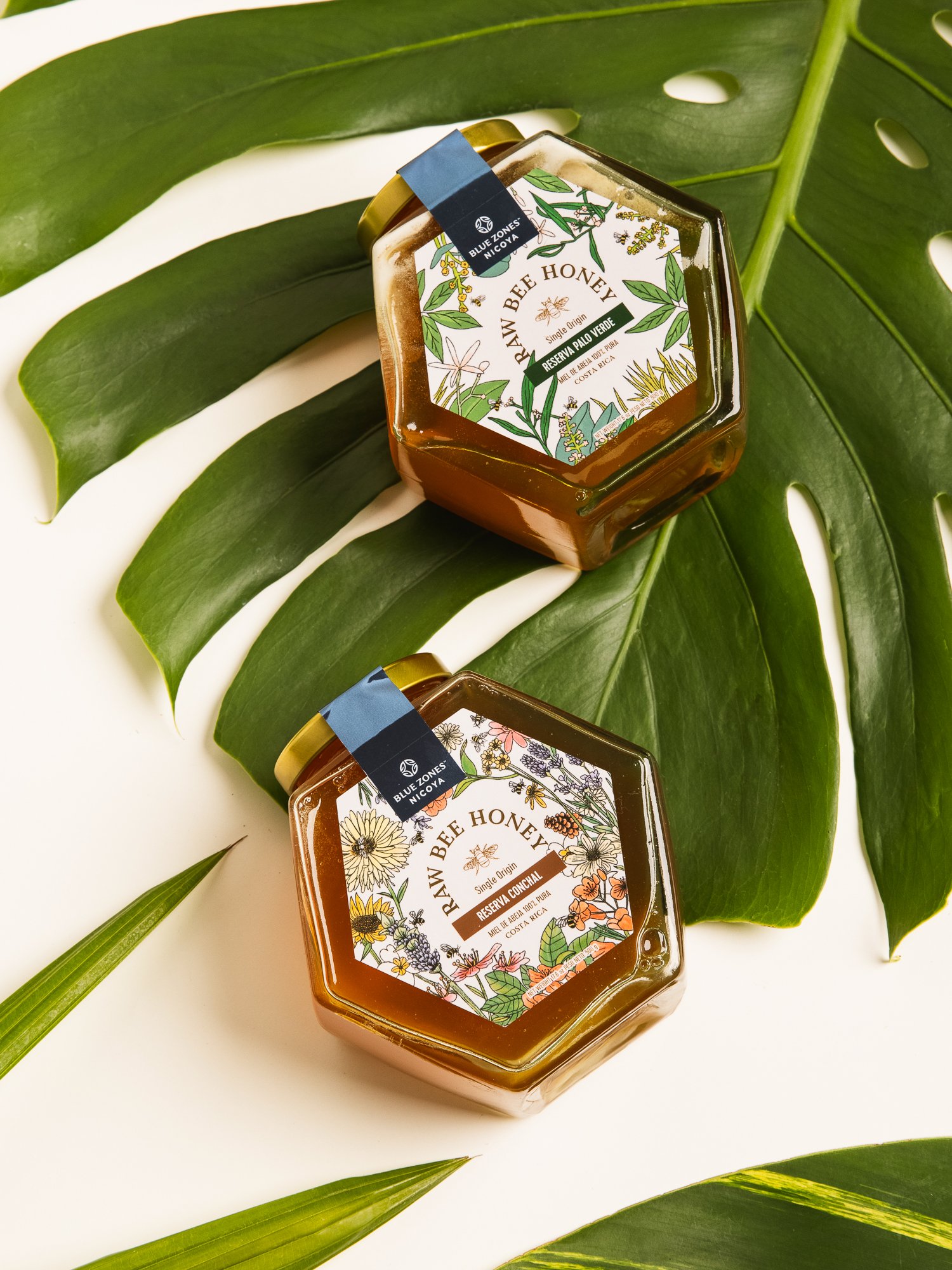
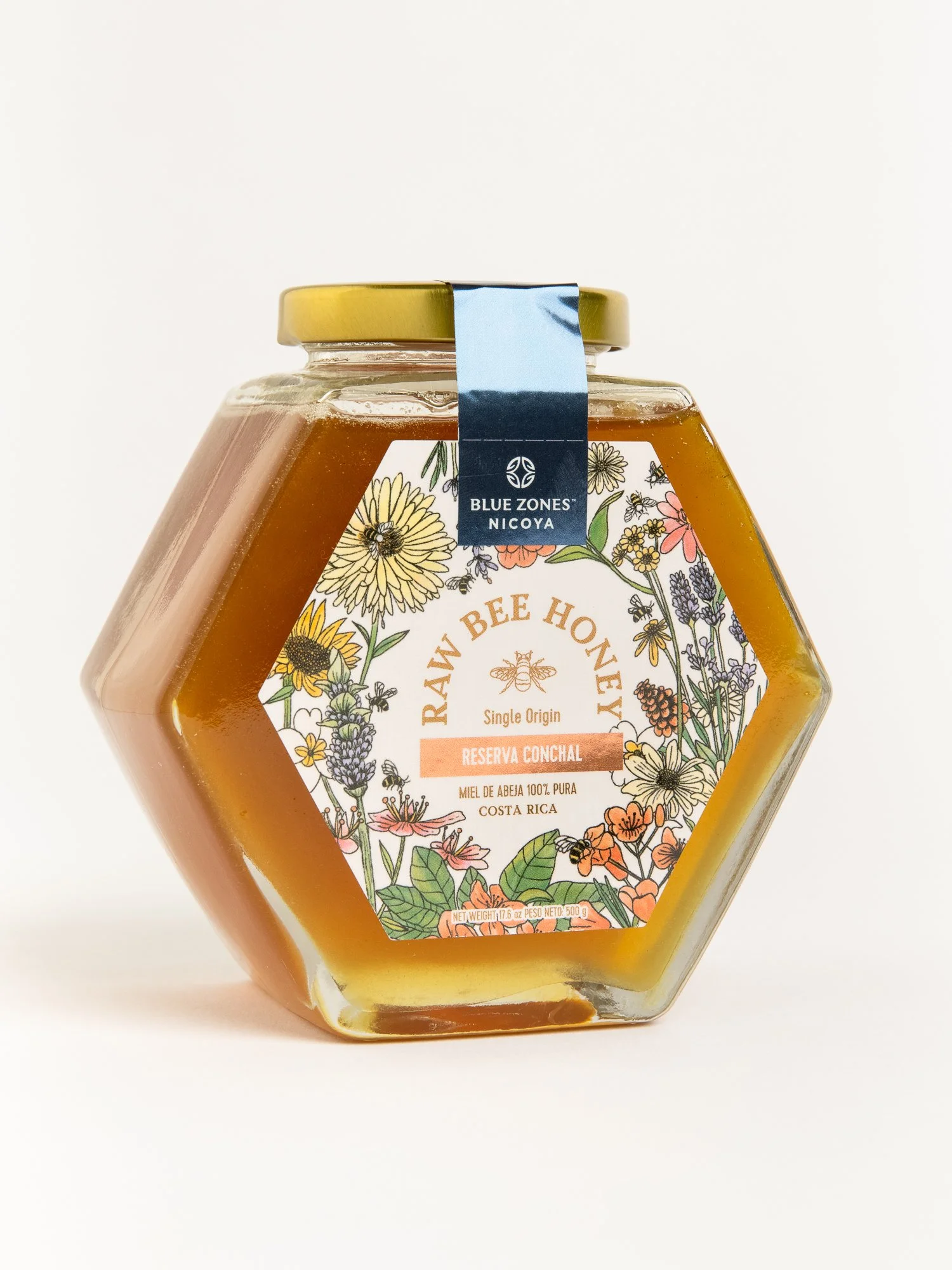
Each product tells its own unique story while staying true to the brand's core values, rooted in the research of local foods from the Nicoya-Guanacaste Blue Zone. The company's mission is to promote and raise awareness of consuming high-quality products that offer exceptional nutritional value and significant health benefits.The label illustrations are based on the flowers the bees feed on, making each design unique to its location. Centenarios Coffee
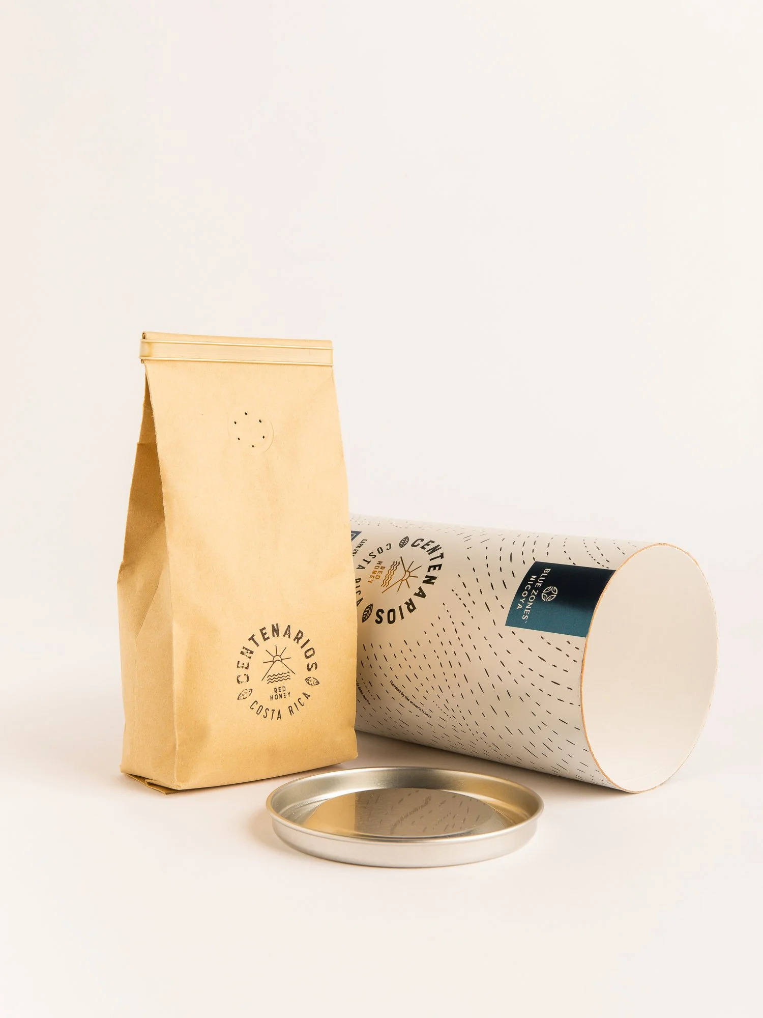
The design is inspired by the environmental conditions of the mountains where this coffee grows, which make this product unique. Flavored by ocean’s breeze, powered by soil minerals and kissed by sunlight. The abstract texture created in the background represents the sea breeze transporting antioxidants to each coffee bean, the minerals that move through the soil and feed the plant, and the sunlight warming the harvest with each single sun ray. The icon brings them all together.