Ombú Natural Soaps
Branding, Label Design & Art Direction
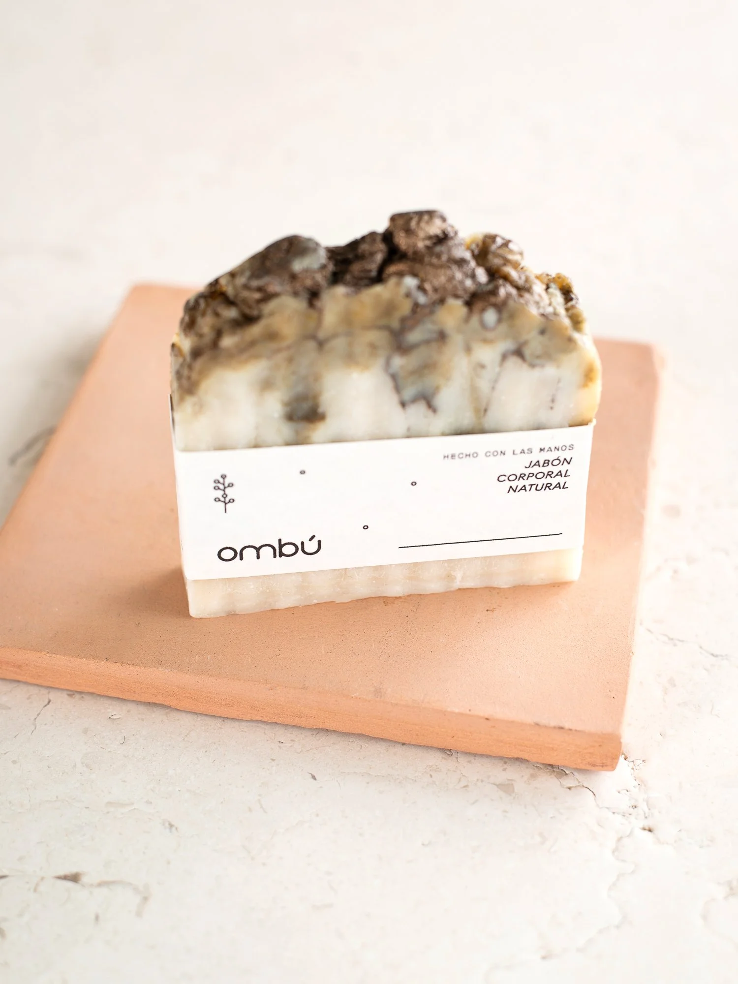
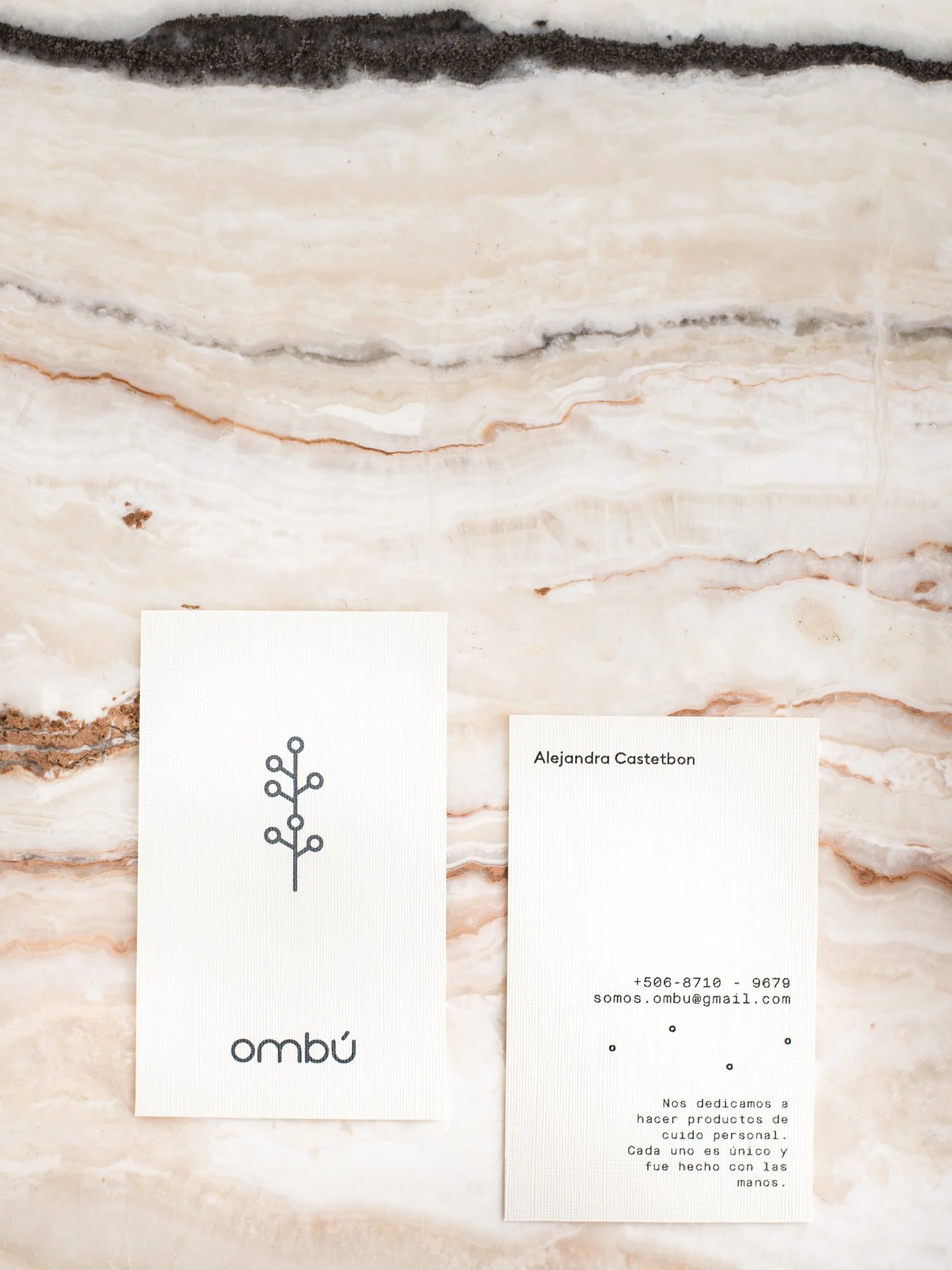
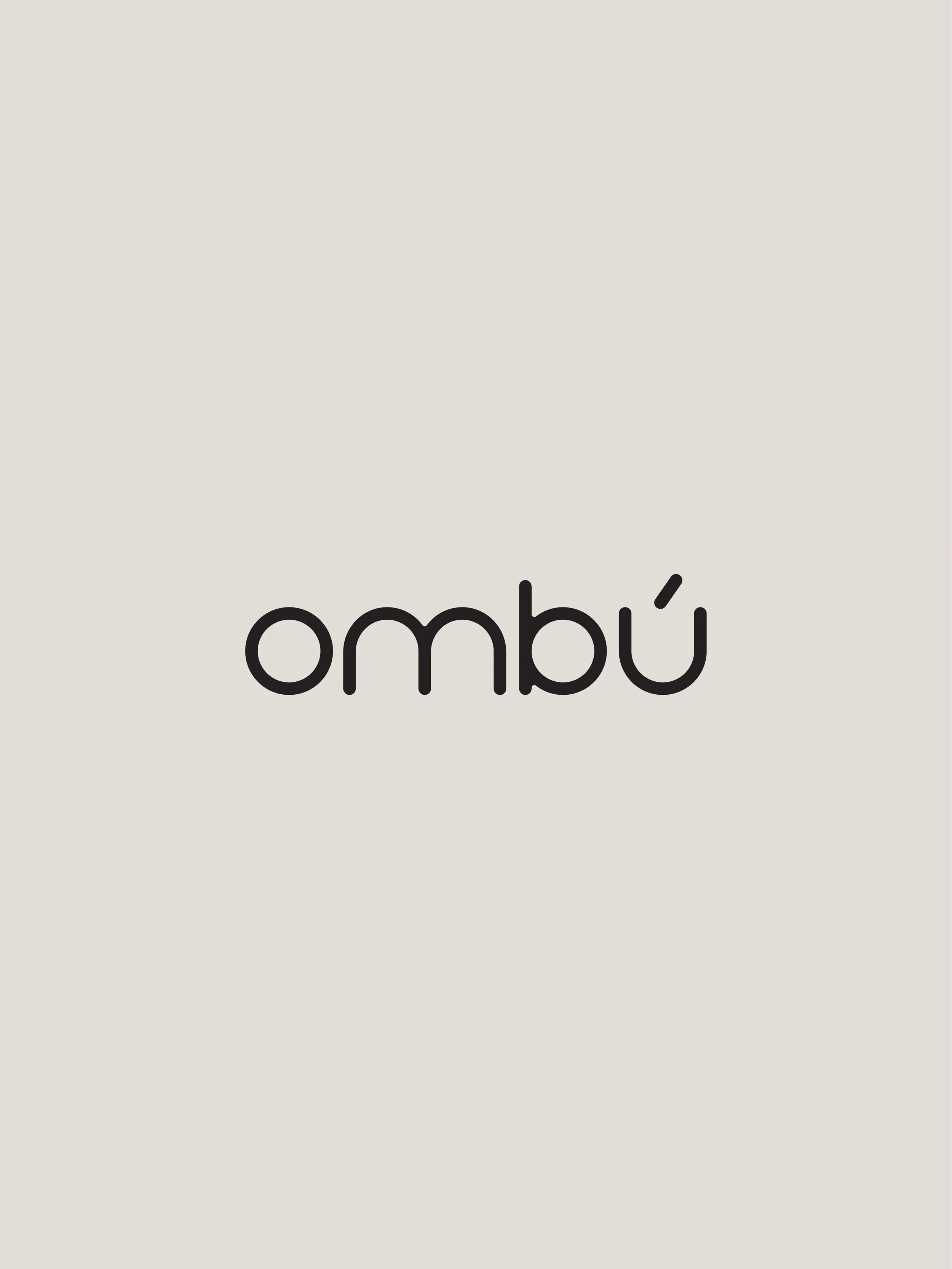
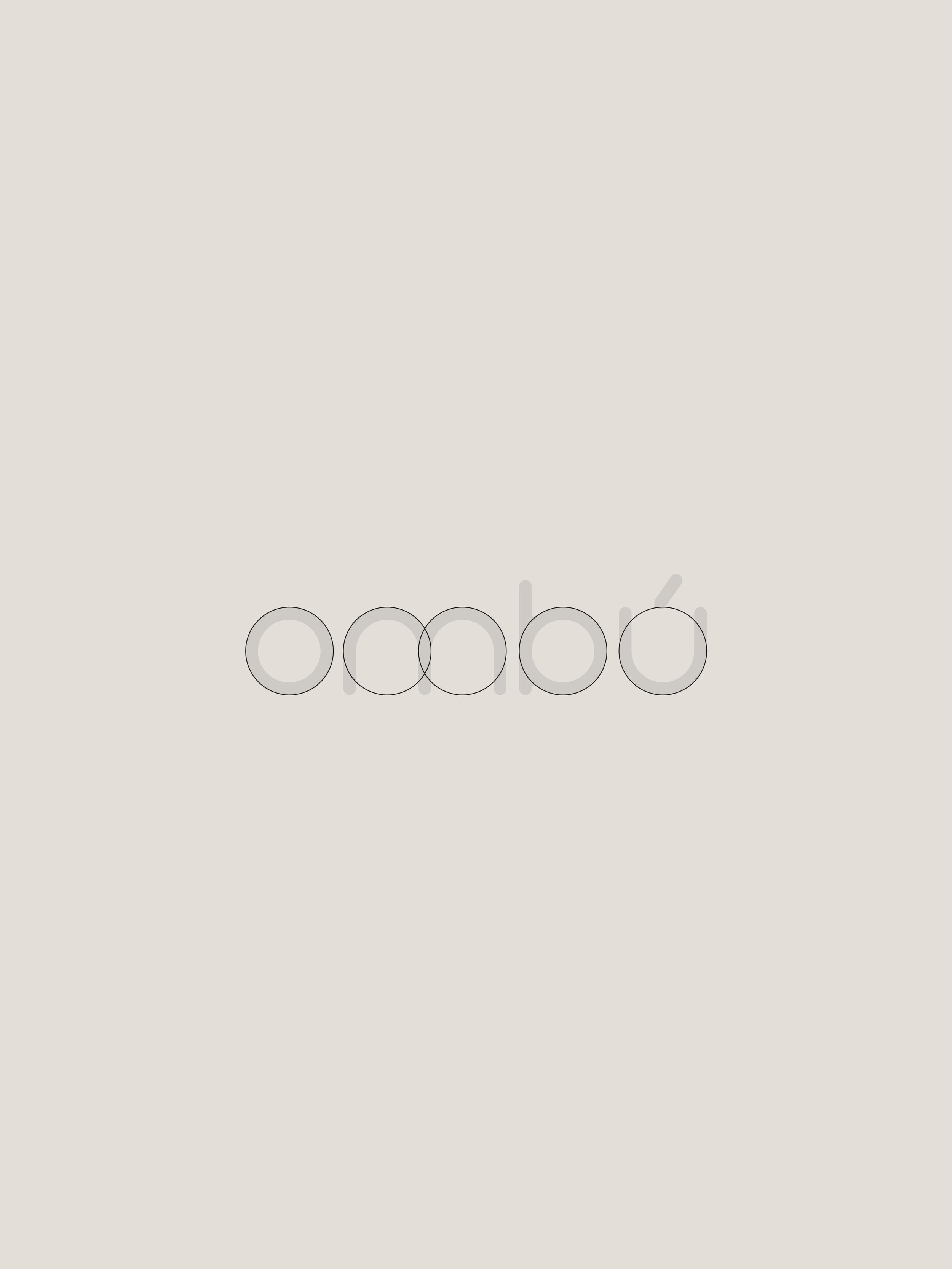
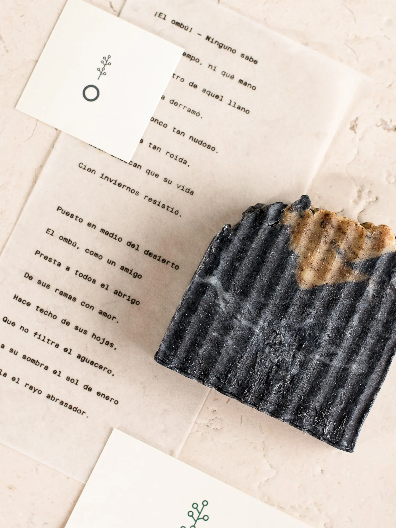
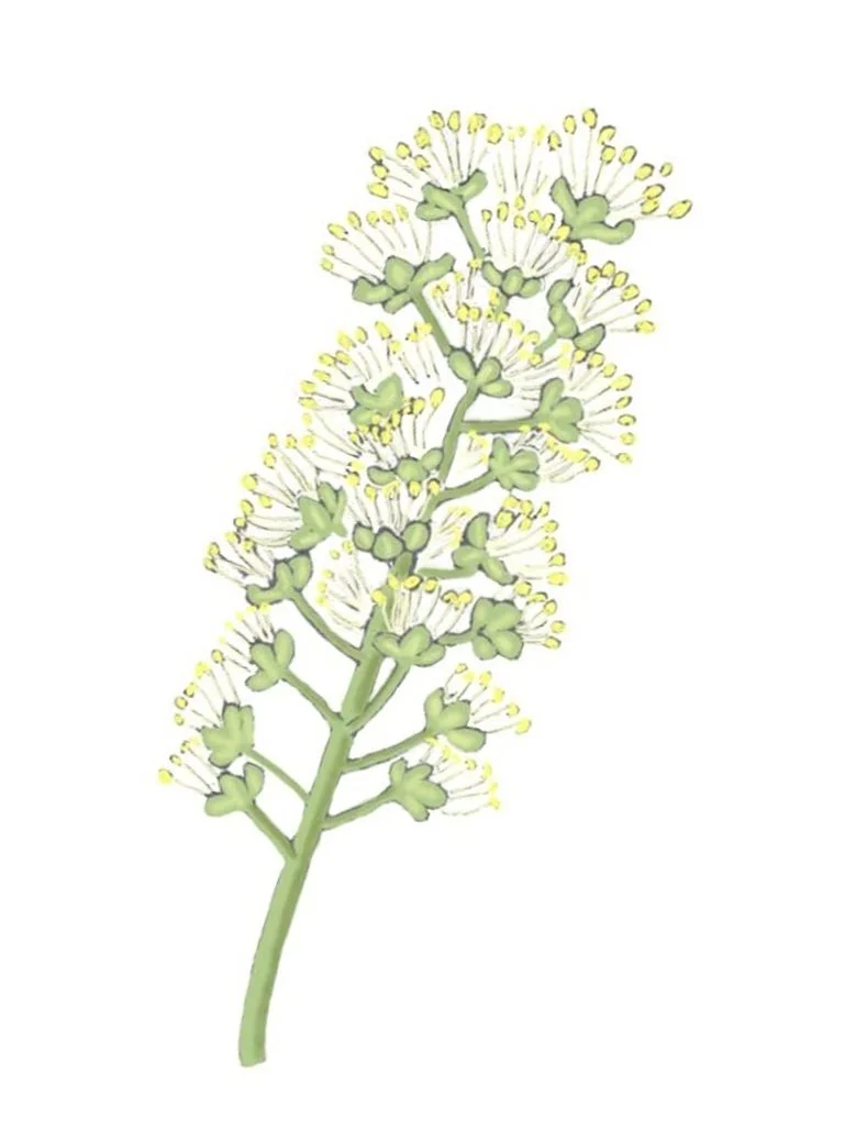
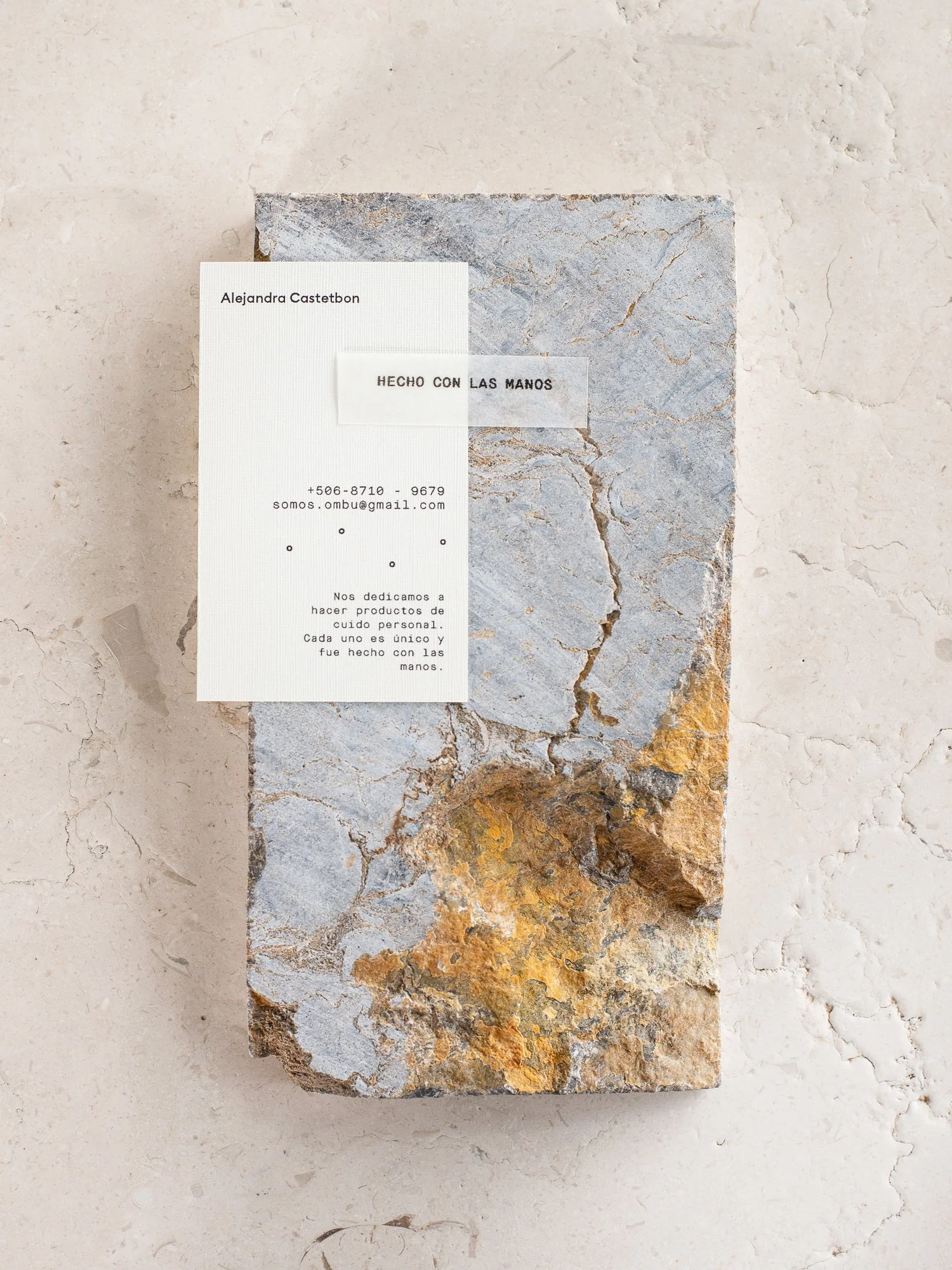
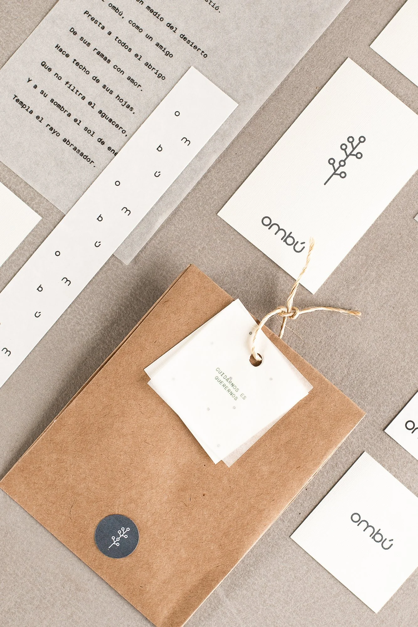
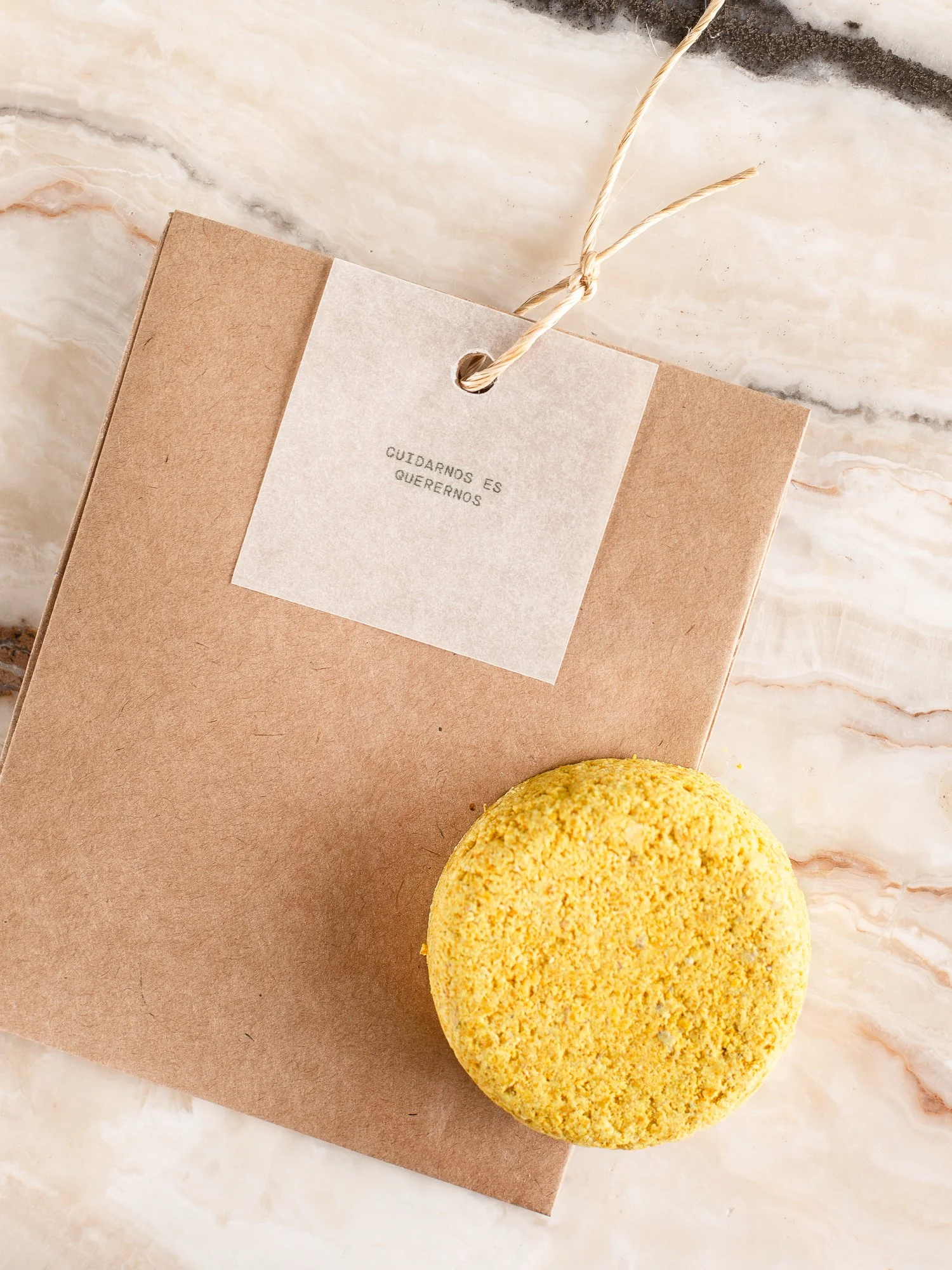
Ombú is a personal care brand offering unique, handcrafted natural soaps. Each bar is made with care, celebrating its individuality and connection to nature.The design reflects the essence of the product, drawing inspiration from the "bubbly" world these soaps inhabit.“The parchment-like label is clean, and effective, using a juxtaposed label and descriptive text that makes the label design clean. We’re loving the slight illustrations featured on the design that appear like bubbles floating away. Shower time just got a whole lot more beautiful.”The DielinePhotography by: Ana Carlota VallesThe custom wordmark, crafted from circular forms, further emphasizes the product's organic and playful nature.The labels were designed with sustainability in mind, using minimal production and a thoughtfully crafted paper wrap. They are also created to showcase the beauty of the product, allowing the natural textures and colors of each handcrafted soap to take center stage.The icon is inspired by the Ombú tree, a massive evergreen native to South America. Its shapes symbolize both the tree's flowers and the bubbles created by the soap.